Tag Archives: 3 stars

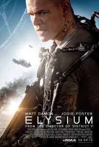
elysium_ver2_xlgI think the fact that this film is so strange makes up for the fact that it sucks so bad. The casting of Matt Damon hurt the film the most for me. The last thing I want to see was Jason Bourne in space. I'll admit that I enjoyed the visuals greatly, especially the video-game like tracking shots, something I've never seen before. The over-simplistic story, bad casting, and Jodi Foster's strange accent made this an oddly entertaining terrible movie. Let's hope Blomkamp's next film goes back to using unknown actors and more realistic premises... like aliens living in Johannesburg.

3 Stars (out of 5)

TheTo-DoListPosterThis movie isn't very good, but Aubrey Plaza is good in it, so I ended up enjoying it. I do like that it's set in the nineties. And for a summertime coming of age romance/comedy it hits enough of the marks to be charming. It is raunchy though. This is the female equivalent of American Pie only instead of trying to lose their virginity after prom, she's trying to do every sexual thing there is to do before starting college. Unfortunately, it's not that easy to pretend all these 30-year old people are teenagers in high school, so the film feels like an SNL skit half of the time. It's charming, in a gross silly kind of way.

3 Stars (out of 5)

2 Comments

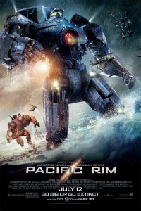
Pacific_Rim_one_sheetThis is a fun movie, don't get me wrong, I just wish it was a slightly better movie. The CG battle sequences are really enjoyable. Unlike Man of Steel or the Transformers movies, Guillermo del Toro is good at adding little flourishes here and there to set a more realistic tone through extended CG sequences. There's more CG dirt, dust, and water in this film than any other I've seen, which can help sell a CG shot by hiding the seams, so to speak, and help it look more realistic. At one point a robot almost falls off of a pier prompting some birds to casually fly away. I appreciate a real-life moment in the midst of an outrageous summer blockbuster CG battle to help remind us we're human. Unfortunately, the movie's characters and the acting were nowhere near as good as the production design and effects. The film feels like half a movie as a result. I did enjoy Charlie Day and Ron Perlman's characters for some comedy relief.

3 Stars (out of 5)

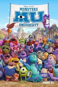
Monsters-University-Poster1It may not be as good as the earlier Pixar films, but this sequel is still better than other animated films currently out there. Even though the story is a carbon-copy of every eighties college movie (minus the sex and drugs) they still manage to stick in so much amazing visual detail, texture, and beautiful lighting that I don't even mind the lazy by-the-numbers storyline. The environment designs are incredible. I especially like how the entrance to every building looks like a monster's mouth. In the end, I'd much rather see a sequel in this universe, than a prequel. I want to see the characters making kids laugh now. We've already done the scaring bit before and it's getting old. "Twins! In a bunk-bed!"

3 Stars (out of 5)

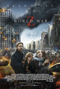
world-war-z-uk-posterThe first act plays out like a (somewhat) more competent version of Roland Emmerich's 2012. A father trying to save his family from the end of the world... In a car, a winnebago, a plane, etc., and always getting away in the nick of time while the world literally crumbles apart around them. It even has a crazy guy that inexplicably knows everything about what's going on so the characters know where to go next, (just like Woody Harrelson in 2012 or Tim Robbins in War of the Worlds, another carbon copy of this story). The rest of the audience probably thought I was laughing because the character didn't have teeth, but I was snickering at the absurdity of Hollywood making the same movie over and over.
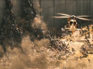
rs_560x415-130325123229-1024.WorldWarZ4.ms.032513_copyThere are some good scares in the first half of the film and some interesting zombie set pieces now and again. As the film continues on it starts to look more rough around the edges. Some parts felt sloppy to me, especially the flashbacks jammed into the airplane scene leading into the final section. I've heard people say they like the intimate, scaled down third act but I found it lacking and am curious about the original ending.

For me the best thing was that great Muse song. It was awesome in the opening and end credits. I'm afraid they may have played it a few too many times throughout the film though. It's such a great song that I wouldn't be surprised if it's a big part of why people are actually enjoying this otherwise flimsy film.

3 Stars (out of 5)
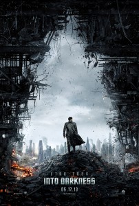
Star-Trek-Into-Darkness-Teaser-PosterAs long as you can turn the thinking part of your brain off for two hours it's a fun ride. Abrams is a master of fun action sequences and the movie is paced so well that I was able to overlook the film's shortcomings. The first issue right off the bat is the convoluted storyline. Seems confusing on purpose so you stop paying attention to the details and just enjoy the ride. The "dramatic" scenes fell flat for me. What should be a dramatic sequence between Kirk and Spock near the end, where their bromance fully blossoms, just comes off like a television-quality melodrama. It's all worth it for the new warp effects and that one moment when they get knocked out of warp. The rotating set gimbal shots they stole from Inception were pretty fun too.

3 Stars (out of 5)

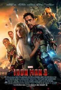
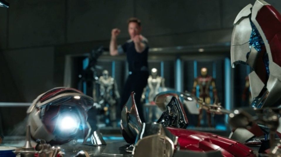
iron_man_3_poster_finalWas happy to see a new director breathe some life into the series and I appreciate all the call-backs to the other Marvel films, most notably The Avengers. Marvel has figured out how to make movies that act more like real comic books. The days of a stand-alone superhero franchise that doesn't tie together with other properties from the same universe may be coming to a close now that the Dark Knight series has ended. Look how Green Lantern ended up without other franchises to prop it up. When all the films connect and form a larger storyline it gives the audience more incentive to see the ones they might not otherwise care about (Captain America, Ant-Man, etc.).

Iron Man 3 has the best villain of all three, and trust me I was going into this expecting the opposite. The film had some pleasant surprises and the action sequences were fast-moving and clever with overly intricate set-ups just for fun's sake. It reminded me of scenes from the old Indiana Jones films where everything goes wrong with one thing after another in a row. Tony Stark escapes capture by summoning his new self-attaching suit that can come to him from miles away (I wonder if he got the idea after seeing Thor's hammer) and then he throws various parts of it to defeat bad-guys while flying around the room and the pieces come back to him like a boomerang. It's strange enough to hold your attention as opposed to mindless punching or shooting "action" in other films.

And at no point did he suddenly discover a new element in this film, which is good.

iron_man_3_trailer_02

Looked great in 3D and the extra depth was helpful in making sense of the complex set-piece at the end of the film. You never know with some 3D movies if it's going to be crystal clear or a blurry mess. Never thought I'd say this but I'm looking forward to Thor: The Dark World more than Man of Steel now. Which do you prefer, colorful comic book type movies or dark and gritty graphic novel style films?

3.5 Stars (out of 5)

1 Comment

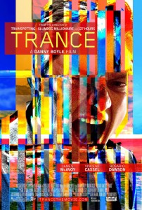
trance-movie-poster-1I remember enjoying it while I was watching it, but the more time that passes the more I'm forgetting why exactly. It's nice that there's a mystery element to the story but once you've seen the film once there's not much else to merit a second viewing. The acting was fine, the directing and especially the use of music was interesting, but the script and the cinematography felt sub-par. I kept asking myself why does this feel like a no-budget indie film? I enjoyed it the once. It goes by at a nice pace and there are some interesting moments interspersed. Could've used a little more action and less of the cheesy, messy, and repetitive talking scenes saying the same things over and over and over again.

3.0 Stars (out of 5)

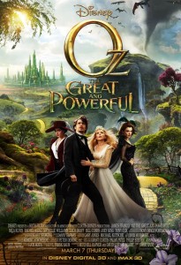
Oz the Great and Powerful Movie PosterI'm a fan of Sam Raimi and as far as Raimi films go this one was pretty darn good, or at least more watchable than Spiderman 3. I was hesitant to give this film a chance but within the first few minutes I was hooked. It's not without its flaws, but overall I was entertained and even pleasantly surprised a few times. The black and white intro, with elements escaping the full screen square, was without a doubt my favorite part and I wouldn't mind watching an entire film shot that way. I was a little sad to see it go when the film widened and turned to color.

3.0 Stars (out of 5)

warm_bodies_ver9_xlgI liked it. It was cute but also a little scary. For a hipster comedic zombie love story, it wasn't half bad. To be honest my favorite thing about it was Rob Cordry's hilariously dry performance and funny one-liners. Aside from the shameless Romeo and Juliet allusions I enjoyed the story, characters, and dialog more than I have for most actual zombie movies. It might not be as funny as Shaun of the Dead or as scary as 28 Days Later, but it's kind of nice to see a film that strives to be somewhere in between. It could have easily all fell flat but the filmmakers did a really good job with the material.

3.5 Stars (out of 5)