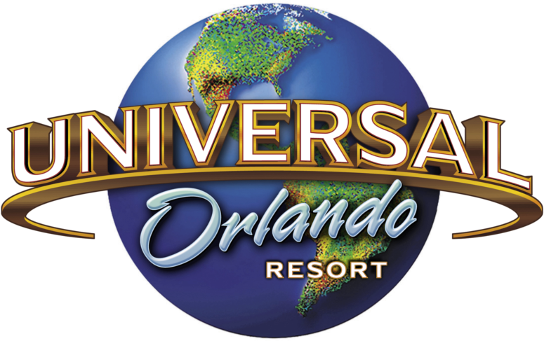
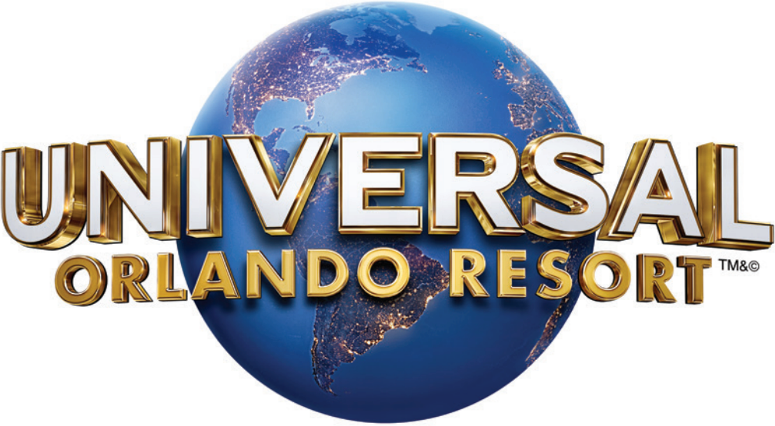
 Universal Orlando has started rolling out a brand new logo, which has already been noticed in commercials featuring King Kong. The new logo was designed to be more modern and to align with the master Universal brand, matching the style of their film company's logo. The new logo will be rolled out slowly over the course of several years. During this time guests may see both the old and the new logos in different places throughout the resort on signs, brochures, marquees, etc. Personally, I like the new logo, especially the way the Earth looks in the background, much more realistic and modern. But it's unfortunate that they just started replacing annual passes with new plastic ones that still carry the old logo. Missed it by this much. What do you think of the new design?
Alicia Stella's Blogosaurus |
Theme Park News, Rides, and Construction Updates
|

Check out my brand new theme park site: OrlandoParkStop.com

